One bold blue to rule them all
We retired our seven rotating palettes and bet on Cobalt. It’s cleaner, sharper, and still unmistakably us.
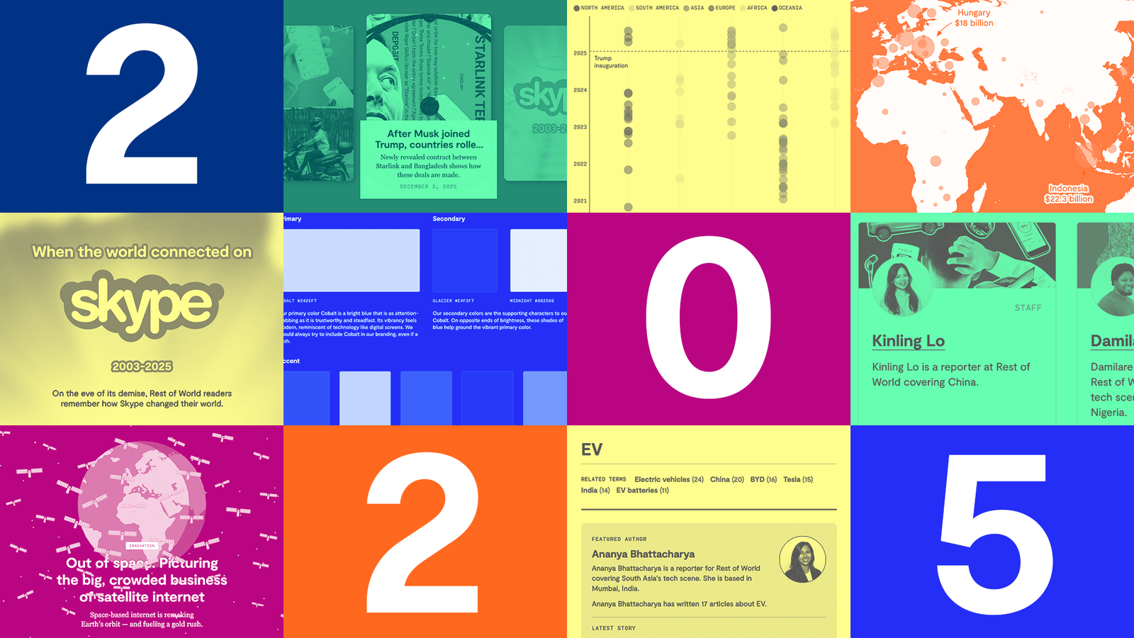
At the start of the new year, Rest of World unveiled its new look. Gone were the seven separate color palettes that were randomly rotated throughout the site. In their place was a singular, cohesive color palette that the product team had worked on developing for months.
We decided to take another look at our color system as the publication reaches its fifth anniversary. Rest of World was no longer the new kid on the block after winning our first National Magazine Award for Design the year prior. It was time to mature the visual identity and re-assess whether or not the multi-palette approach was still working for us.
If you’ve visited the site within the last few months, then you’ll have noticed that we are now using Cobalt Blue as our sole primary brand color. Another big departure is the site background, which used to shuffle between pastel tones like lilac and fog and now remains a clean and simple white.
This new look feels smart and evolved but still vibrant and online, marking a new chapter for Rest of World. On a practical level, there is much less decision-making and work for the team whenever a new page is created. From a big picture perspective, readers arrive at a Rest of World story and are greeted with a familiar, recognizable design.
Finding our one true palette
Rest of World launched with seven distinct color palettes, a deliberate choice that reflected our ambition to stand out and signal something different. At the time, we were looking to make a splash as soon as we entered the media scene and stand out from our competitors. Our mission to cover tech stories in places that are typically overlooked and underestimated by the West also aligned with the diversity of colors. We understood that color carried different meanings across cultures, and by adopting variety, we aimed to be expressive and a little unconventional.

An issue that we encountered with this approach was the lack of cohesion on our site experience as we grew. For example, on visiting our site, a palette would be randomly assigned for the duration of the session, meaning on one visit the homepage or pages palette could be purple one day, and then green another day. Our photo team selected palettes for each story depending on the visuals assigned, cycling through them and asking illustrators to pick a palette to match with. While the variety of colors made our site feel fresh every visit, we found one common feedback in user interviews to be confusion on the logic behind the color changes, and consciously selecting palettes and visuals to match them was adding more cognitive load to a small photo team juggling multiple projects.
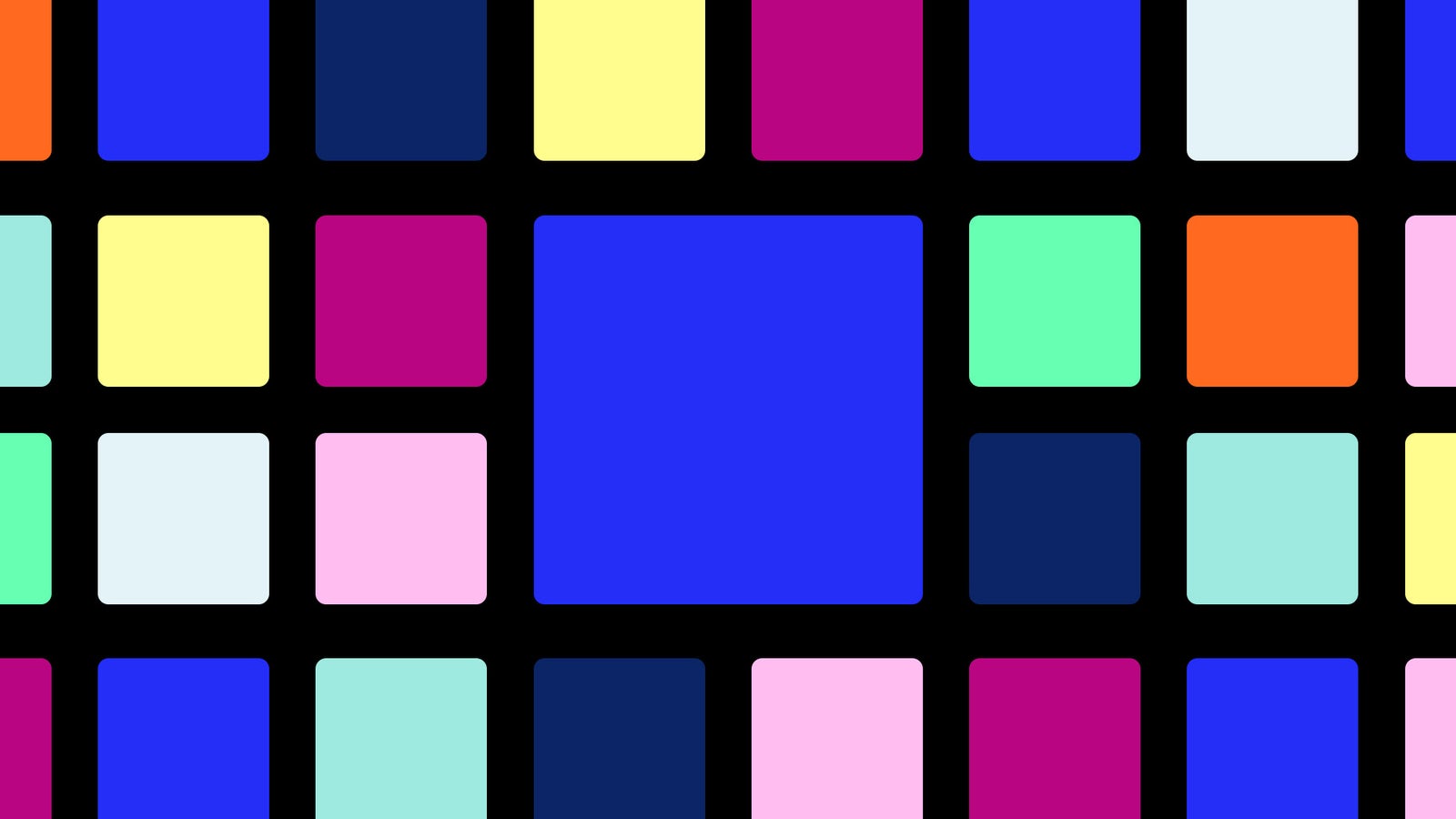
For the refresh, we knew we wanted to try out a single color palette that comprised a more robust range of colors. The first step was looking at the palettes that already existed and determining which one felt most Rest of World. We landed on the Cobalt Blue, which had been used regularly for our marketing and fit the objective of conveying maturity and reliability. We still wanted a vibrant image after the reduction of colors and amped up the saturation and depth of the blue from #0043EF to #242EF7.

From that point, we started looking into what secondary colors as well as background would work with the Cobalt Blue. A light and a dark hue of blue would help ground our new primary color. Bright accents in pink, green and orange add some much-needed warmth to the site. We ended up with a bright and visually distinctive palette that is versatile enough to be used across the many different needs of the site.
A clean canvas background
Let’s talk about it. There aren’t any more pastel backgrounds on the site. What made us decide to transition to a white background? Well, we realized that there are ways to be different from competitors without inserting color at all times. Our logo is already distinctive and flexible thanks to its modular diacritics. We also have very strong visuals, whether that be illustrations, photography or graphics, and after some speaking to our visual editor and some side-by-side comparisons, we realized that the pastel background at times detracted from these elements.

It took some getting used to from our end. We had grown accustomed to the ever present wash of color in the background after 5 years. But it seemed like a good time to try something new, and now after a few months in practice, we hardly miss the color anymore. And most importantly, our colorful visuals now jump out on the clean canvas of a page.
Incremental changes for the rollout
This is a big change to deploy sitewide. I remember feeling nervous about the scale of the refresh which needed to be applied to our homepage, articles, organization pages and more. However, there was nothing stopping us from implementing the new palette in stages. This made the process less stressful and was a good reminder that change can be incremental.
The first phase of the rollout was literally just the homepage, which I consider to be the front entrance to a website. The homepage of a media publication signals to users: this is who we are and these are the stories that we write. Branding is more important here than ever. Afterwards, we moved onto the second phase: articles. These pages are the heart of our website, what readers are making the visit for each time. They should leave a lasting impression that feels Rest of World without being distracting from the story itself. Finally, we reached the third phase and applied the palette to the rest of the site, which mostly comprised organizational pages like our About page and Awards page. Altogether, the site rollout process took roughly 3 months, but the incremental approach meant we could tackle the update in between lots of other things.

Design is never finished
This redesign was never just about aesthetics. It was about clarity, consistency, and growing into who we’ve become. The process reminded us that evolving a visual identity doesn’t mean abandoning experimentation, it just means being more intentional with it. As we continue to grow, we’ll keep watching how the new palette performs; where it succeeds, where it strains, and where it might need to stretch. Design is never finished, and neither is Rest of World.