The year in Product
A look back at the features, experiments, and foundations we built at Rest of World in 2025.
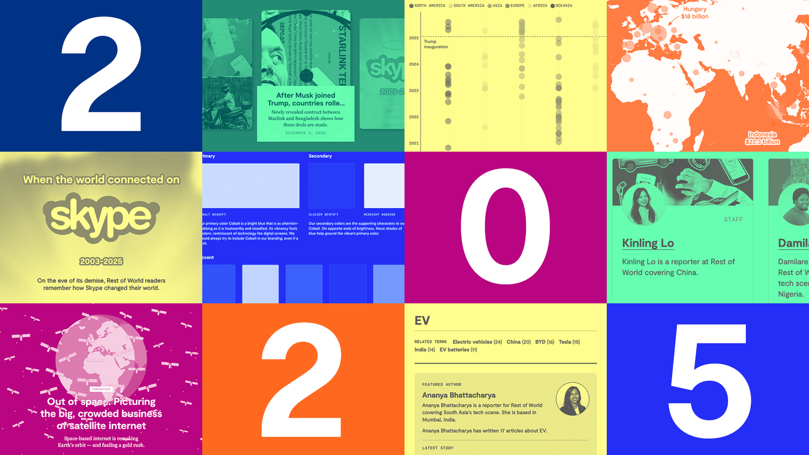
My, what a year 2025 has been! Global instability, tariffs, new geopolitical landscapes, natural disasters, new startups, platforms, and leaps in technology and innovation.
This year was pretty unusual for us and the organization, as we reset our audience strategy, hired a new publisher, and celebrated five whole years of Rest of World. It was a year of reflection and taking stock, rather than making big, bold moves.
As we worked through a major strategy reset this year, we on the product team took the opportunity to focus on features, products, and initiatives that added value and set us up for future success without taking huge, irreversible swings. To that end, at the start of the year, we set ourselves some high-level objectives: Continue to delight readers and experiment with our storytelling, focus on engaging readers and helping them discover more relevant content on-site, make Rest of World sustainable for the future, and do more good.
If you didn’t already know, the product team at Rest of World consists of a designer, an engineer, a product manager and a chief product officer. We work to help our journalism reach our audience where they are, in the right way and the right format, and we work in collaboration with the rest of the organization — on the website, newsletters, social presentation, audio, feeds, and everything in between. It’s our job to ensure that our journalism serves the needs of our audience in a sustainable way.
Here we attempt to break down our favorite things we worked on this year that helped us meet those goals.
Delightful storytelling
One area we feel we truly excel in at Rest of World is our visual storytelling. We’re always trying to push the boundaries of what’s possible, and tell stories in unique ways that enhance the experience for our readers. We collaborate with our editorial and visuals teams to elevate our journalism and create these wonderful visual storytelling moments.
How do we know when we’re successful? Well, sometimes we win awards, but ultimately we know when we see a high level of engagement with a story, readers reach out, and we take pride in the work we’ve produced. Ultimately, if we like what we see, we think you will too.
Skype
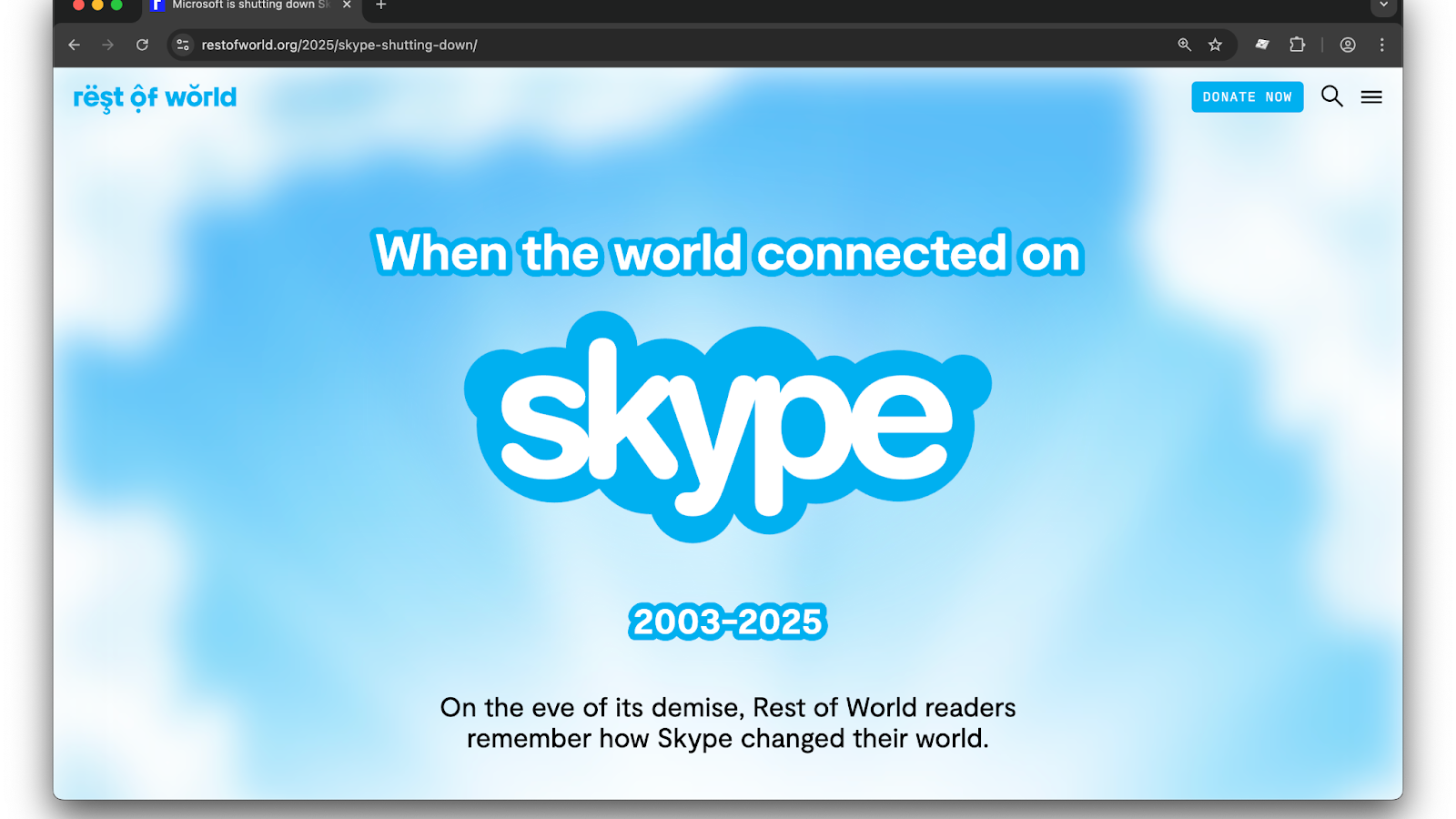
In May this year, Skype was retired after several years of being the digital video communication tool of choice for almost everyone online globally. To mark the occasion, the editorial team wanted to write an homage to the defunct platform, and gathered anecdotes from readers across the globe describing what the platform meant to them and the impact it had on their lives.
The challenge for our team was representing these disparate anecdotes in a cohesive and meaningful way that allowed readers to dive into different formats including text, quotes, audio notes, and videos.
Joanne, our designer, drew inspiration from Skype itself and introduced playful elements and animation to create a truly delightful experience that allowed readers to peruse the story, dip into anecdotes, and evoke a real sense of nostalgia while they did it. Witness it in all its glory here.
Scrollytelling
In June, we published a story about the satellite internet market. Our editorial team wanted to compare the market dominance of SpaceX’s Starlink to other emerging internet providers like Eutelsat OneWeb, and Spacesail in a visually led way. Sometimes a picture paints a thousand words, and rather than trying to convey complex comparisons and data in text, we wanted to use simple and easily understood illustrations.
This story also marked our first experiment with video scrollytelling. As readers scroll, a video plays in sync with the narrative, with text tied to specific moments in the animation. It’s a format often used by larger newsrooms for data-rich stories, and one we’d long admired but hadn’t yet managed to pull off as a small team. Until now!
Enter Anna, senior front-end developer. Using a lightweight, open-source JavaScript scroll-trigger library alongside our existing WordPress “conveyor gallery” (which pairs text with images, but not video), Anna built a smooth scrollytelling experience that synchronizes video playback with the reader’s scroll position.
Our visuals team collaborated with an illustrator to produce the animation, and we carefully mapped the copy to key frames in the video. As with everything we build, accessibility and performance were nonnegotiable. We encoded the videos to keep them as small as possible without compromising the frame-rate required, and deliberately kept the JavaScript we loaded on the page to a bare minimum.
The most exciting part? This is no longer a one-off. With scrollytelling now in our toolkit, we can experiment with richer, more ambitious video-led storytelling in future projects.
Engagement and recirculation
As a relatively new publication, we’ve focused on growth for the last few years, but we’re now shifting to focus on engagement. That means making each visit to our site useful for the reader, helping them find what they’re looking for, and introducing them to stories and product features we think they’ll enjoy. It also means recirculating stories and projects we’ve worked on in the past that are still timely and relevant. To that end, we focused on several products, both big and small, which repurposed our existing content and presented it in new ways.
Showcase module
The homepage is not dead… We still view our homepage as the doorway to Rest of World, and we know that the people who come to our homepage are some of our most loyal and engaged readers. We also know that a large portion of them are visiting and exploring our site for the first time, and figuring out what we’re all about.
For those new and returning users, we wanted to create a dedicated space within our homepage for some of our favorite projects and stories, and present them in a visually striking and interactive way.
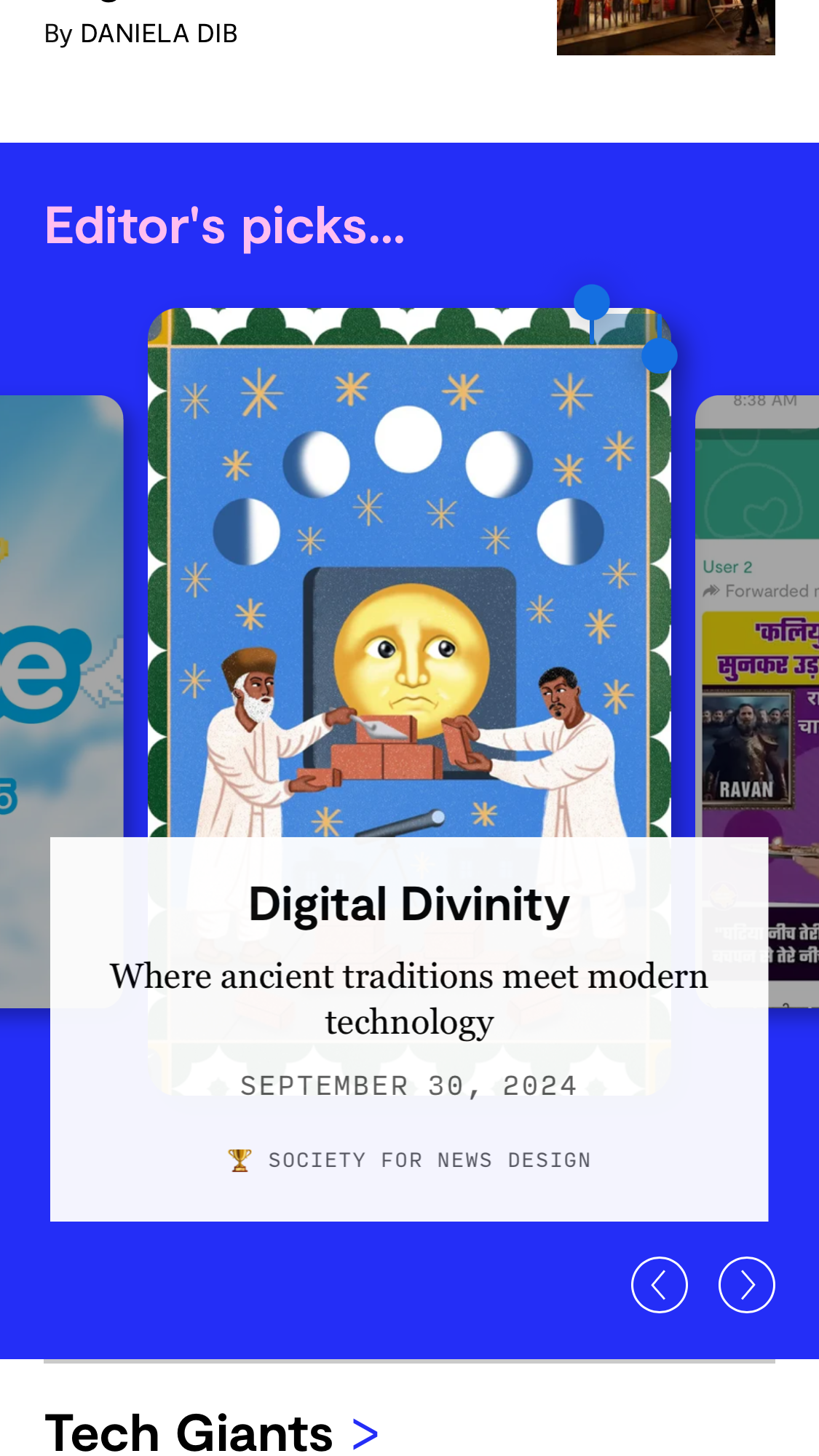
We created the “Showcase” as a new block within our homepage curations to elevate our visual projects, and allow readers to scroll, swipe, and explore those projects. It’s designed to be delightful to use, and allows our audience team to pin stories, order by favorites, order chronologically, and edit as needed.
The Showcase block was built with love by our former colleague and friend, Lily, who wrote about it and more here.
Tag pages
This year, we also set about giving some love to our less-trafficked pages on-site including the humble tag page. What is a tag page, you say? Great question.
Basically, all of our stories can be described by using a tag: think person, thing, company, place. Tags help us describe a story in a simple way that can be easily interpreted by machines and humans. We leverage tags in our Related Stories recirculation and homepage curations, and surface the tags as metadata on our stories, allowing search engines and LLMs to more easily categorize and crawl our content.
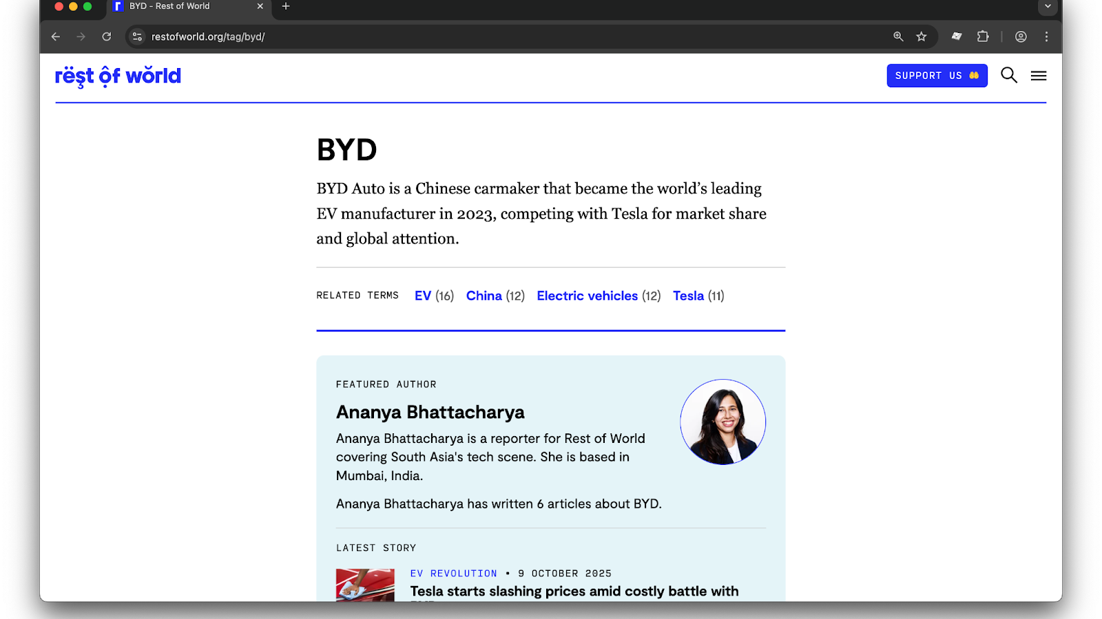
Every tag we create automatically generates a page, and when we looked at our analytics we saw that these pages had the opportunity to drive a long tail of engagement. To address this, we focused on making them more of a destination and elevated experience that could help readers discover more relevant content. We added a featured author section, highlighted stories, related terms and charts, and a list of all of the relevant stories.
The result is richer tag pages that readers can explore and follow to gain deeper context and understanding of a topic.
Charts
In case you didn’t already know, we’re data nerds at Rest of World, and there’s nothing we love more than a chart. Datawrapper is our platform of choice for creating data visualizations, and we’ve created many beautiful charts, graphs, and maps over the years.
Michael, our chief product officer, found a way to parse Datawrapper charts from our published stories and create a dedicated home for them on our site, which allows readers to explore our visualizations. It also allows our internal team to use it as a handy reference and visual guide.
In our dedicated Charts hub, you can dive in and explore each chart, the story it pertains to, related tags, and you can share it as well. We also have a dedicated module to display Charts from the homepage, as well as a small callout to share and explore charts within the stories.
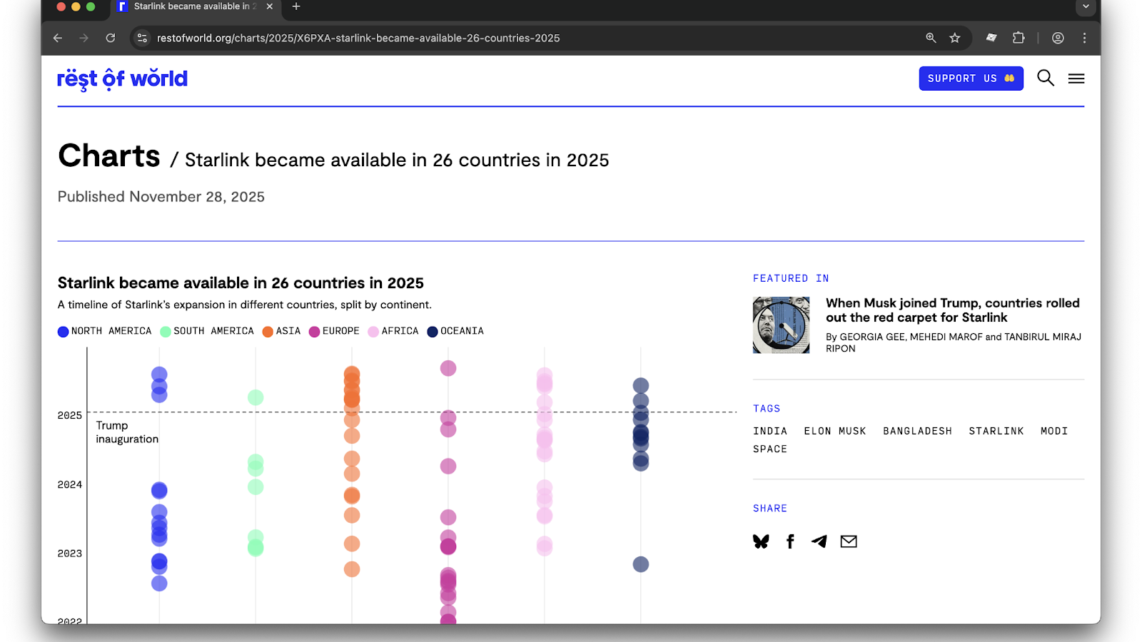
Since launching Charts, we have seen more engagement with our data. One observation we’ve made is that our editorial team has produced some of the best data visualizations this year. It’s nice to know we’re elevating (and maybe encouraging) their great work.
Accessibility, sustainability, and growth
While we’re always looking for ways to grow and experiment, a lot of our effort goes into the less glamorous work of making sure everything works, and keeps working. We’re constantly iterating on our site, content management system, styles, and underlying tech to ensure the experience is accessible, performant, user-friendly, and visually considered. (Design matters to us.)
Brand updates
If you’ve been reading us for a while, you may have noticed that this year we moved away from our multicolor palette to a single, unified brand palette and style. This was a monumental undertaking from Joanne, with support from the entire team, and involved rolling changes out across our entire site, our social and visual assets, business assets, and illustrations. You can read more about it here.
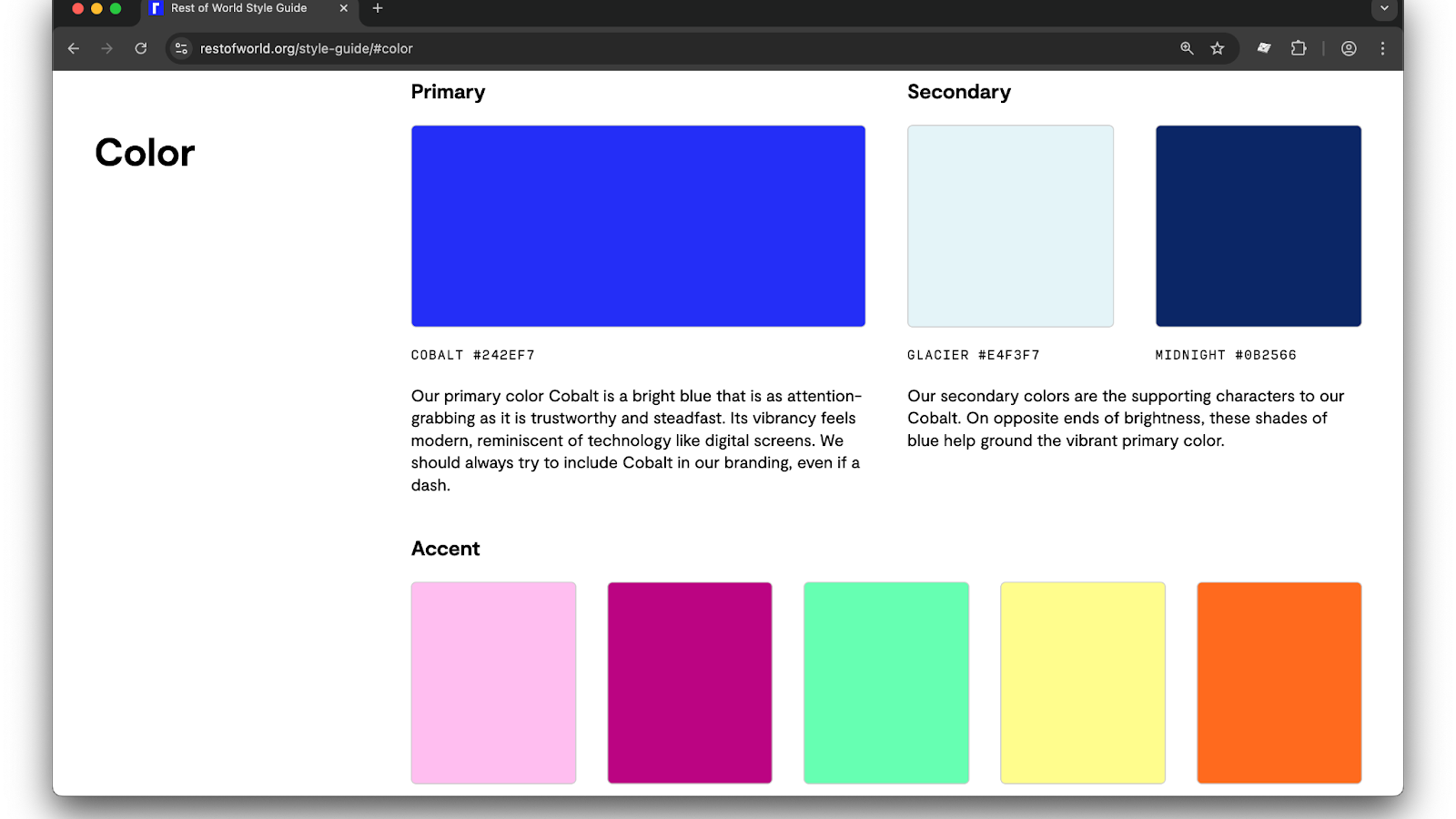
At first, we were slightly wary of a homogeneous color palette, and worried that our single cobalt blue brand color and stark white background might flatten the site’s appearance. But we’ve learned that it’s elevated our visuals across the site, and made it so much easier to commission and create visuals that aren’t at risk of clashing with random colors. Anything we can do to reduce the cognitive load for our busy editorial team is better, too!
The new palettes and styles have also been a boon to engineering in terms of maintaining multiple colors and styles, and has opened up more possibilities to explore new palettes when designing custom projects.
You can see our beautiful new palette and updated style-guide here.
Fastly CDN
Web performance continues to be an obsession of ours, and this year we rolled out a new content delivery network to serve images across the site. We opted to use Image Optimizer service from Fastly because it included a series of useful features we could leverage including cropping, resizing, and dynamic formats.
The biggest impact of this change is that we can now render all of our images on-site in the lightweight and performant WebP file format (where supported), massively reducing image-loading times. We can also optimize, cache, and serve images more quickly — so whether you’re in Belfast or Hong Kong, our images will load faster.
Behind the scenes, this shift also simplified our image handling code. Less maintenance means more time to focus on building new things.
Public good
As technologists who work in the tech journalism space, it’s incumbent on us to try to do good and be better by ensuring the work we do serves our journalistic mission. We want to give back to the wider community, and elevate the good work of others.
We’re working on this, but it’s an ethos we try to bring to the features we build, and to our roadmap. (If you have ideas of what we could do, or do better, we’d love to hear from you.)
AI narrations
Earlier this year, we developed a WordPress plug-in that generated AI narrations for our stories using OpenAI’s text-to-speech model. The goal was to make our stories more accessible to readers who might struggle with text-based reading, as well those who prefer to listen rather than read. We’ve enabled this feature only on stories that have 1,000 words or more, and this year we’ve generated 161 story narrations.
In November this year, we made the AI Narrations plug-in completely open-source, and free to use and extend as needed. It was our first time open-sourcing a utility we use in this way, and we hope to do more of this in the future, as our way of giving back to the wider journalism community. You can read all about it here.
Contributor index
Rest of World would not and could not exist without the humans who report and tell our stories.
We want to elevate them and their good work, and spotlight individuals who regularly contribute to our reporting.
We’ve built out a few site features to give more visibility to our contributors, like extended bylines, artist bylines, and featured authors on tag pages, but we wanted a central hub to see everyone who has ever contributed to our reporting. This is where our contributor index comes in.
The index is a place to peruse everyone who has ever contributed to a Rest of World story, in one place. We’ve ordered this page chronologically so you can easily find who you’re looking for, but we also added a useful module to the top of the page to spotlight our most recent contributors and their stories.
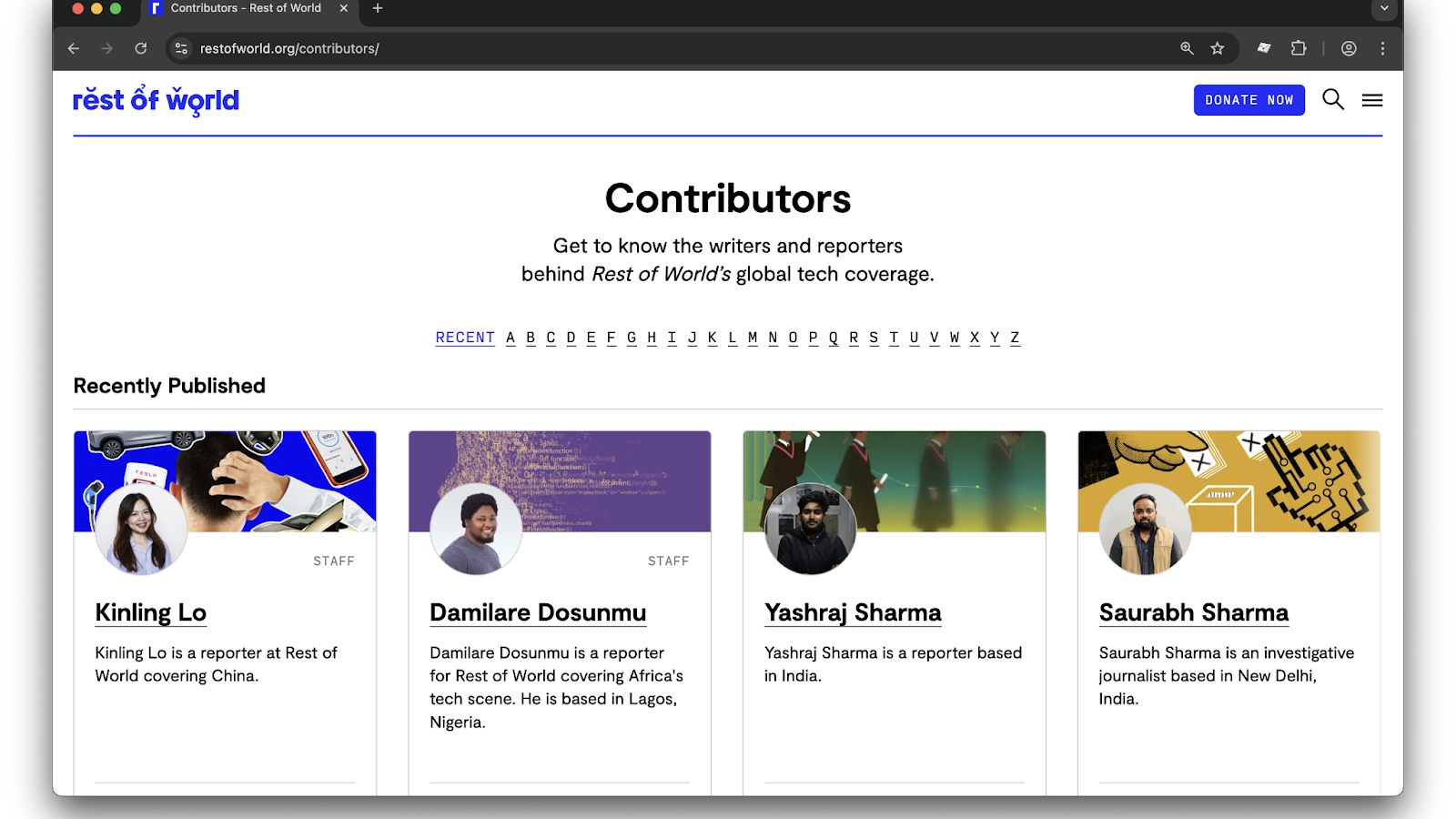
We love this page because it reminds us of the humans who have made — and continue to make — Rest of World an essential, trusted, and groundbreaking publication.
Looking forward to 2026
2025 was a good year for taking stock of where we are, looking at modest but lasting improvements to the website, and building for the future.
Now that we have a new audience strategy and a new publisher to chart our course, we’re looking forward to taking some bigger swings next year.
If you’ve read this far, thank you! If you have any questions, suggestions, or feedback, please don’t hesitate to contact us via email at hello@restofworld.org.
Stay tuned for more in 2026.