The Genesis of Digital Divinity
Behind the scenes of how we developed a visual journey exploring the intersection of faith, storytelling, and technology
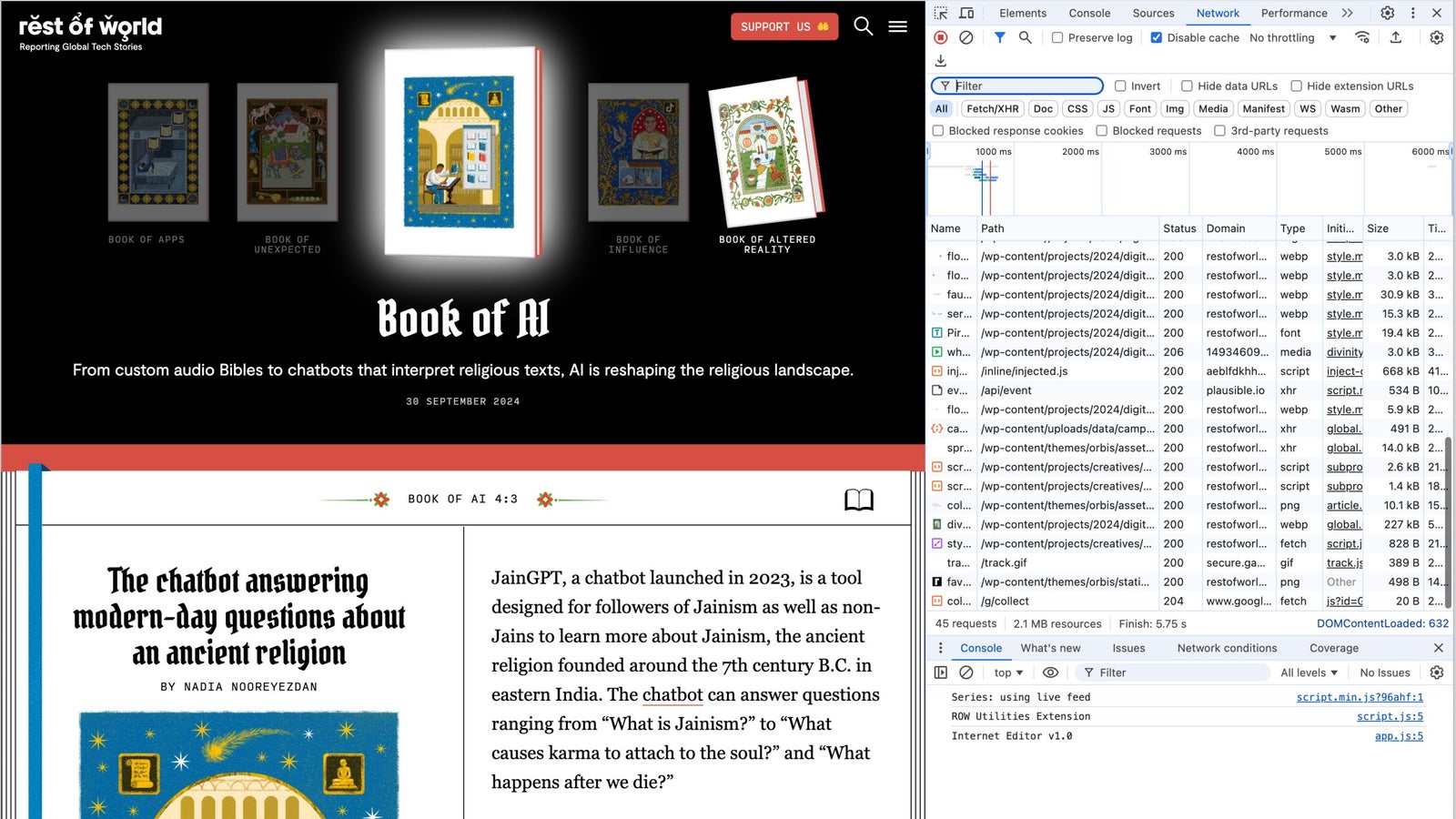
I’m very excited about the launch of Digital Divinity this morning; a unique collection of 22 illustrated stories on how technology impacts how people worship, pray, and live their spiritual lives. This project stands out not just for its storytelling but also for the artistic and technical efforts behind it. It’s that blend of art and engineering, requiring the collective efforts of our talented team to bring it to life, that I’d like to explore a bit.
Artistic Direction
The project’s artistic vision was led by Cengiz Yar on the editorial side and brought to life through the illustrations of Glenn Harvey. Initially, we considered commissioning traditional woodcuts, but as the project evolved, a medieval illustration style emerged as the preferred direction. Our designer, Joanne Lee, provided the perfect frame for this concept, collaborating with Glenn to expand the work and ensure every element was cohesive – then working with our talented engineers (hey Lily and Anna) to balance design, performance, and feasibility.

The challenge was to create a balance between honoring traditional, even ancient formats and embracing the digital medium on which the project would live. Early concept art made it clear that replicating the feel of paper would be too limiting. We took inspiration from traditional illuminated manuscript and other religious book designs but avoided a full skeuomorphic approach (that’s where you mix visual elements from the real world, like photos, with digital imagery). Instead, we focused on highlighting the rich, intricate illustrations in a way that honored their depth and complexity.
Design and Typography
Joanne also gave significant attention to typography, an often-overlooked aspect of digital projects. Holy books are known for intricate and artistic text, so we sought to pay homage to that tradition. For the first time, we added a medieval-style typeface to our site specifically for this project. Although this font sacrifices some readability at smaller sizes, we carefully limited its use to headlines and key areas where it could shine without compromising the user experience.
User Experience and Accessibility
Navigating such a large and visual project presented its own challenges. We integrated chapter-based navigation directly into the header design to make it easier for readers to explore the different chapters. Given the scope of Digital Divinity, we didn’t expect readers to cover everything in one sitting, so we focused on creating a seamless way to jump between stories.

We’re monitoring Page Depth and other metrics to see how this approach resonates with our audience and what improvements can be made for future projects. Our audience team has also created a limited-run or popup newsletter for those readers who want to experience the project over time via their inbox.
Accessibility was a top priority throughout the project. Every illustration is accompanied by carefully crafted alt text for screen reader users, ensuring no one is left out of the experience. We also put considerable effort into optimizing page-load times and reducing bandwidth usage, especially useful for readers in regions with slower internet or costly data. Despite the visual richness, we kept the average article size to around 900 KB—a significant achievement when compared to major publications like The New York Times (5.5 MB), Wired (4 MB), and The Guardian (1.4 MB) – all with ad-blockers enabled.
Technical Performance
For readers on devices that support High Dynamic Range (HDR) imagery, we introduced a small but subtle feature; HDR video layers behind key illustrations, creating an ethereal glow. This detail enhances the visual experience, particularly for the ~ 30% of our audience who can take full advantage of it. It’s an additive touch that we feel sets Digital Divinity apart and complements the nature of the illustrations.
However, these enhancements to our normal article template came with a performance cost. While our regular articles score highly on Google’s PageSpeed—usually above 85/100 on mobile and 99/100 on desktop—this project, with its added code and imagery, saw a drop to 59 on mobile and 76 on desktop.

Despite this, we felt the trade-off was worth it for the added visual and interactive richness. We’re also keeping a close eye on how readers engage with the content, constantly looking for ways to optimize without compromising the experience.
| Publisher | Page Size (MB) | Mobile | Desktop |
| Rest of World: Divinity | 0.9 | 59 | 76 |
| Rest of World: Article | 1.1 | 86 | 99 |
| The New York Times | 5.5* | 44 | 88 |
| Wired | 4.3* | 39 | 58 |
| The Guardian | 1.4* | 38 | 56 |
Final Thoughts
As a team, this project was particularly high on the “fun” factor. The intricate illustrations provided room for creative exploration (and the occasional easter egg), and the blend of art, technology, and storytelling made this one of the most exciting projects we’ve worked on. We’re eager to see how readers engage with Digital Divinity and what we can learn for future projects.