New and improved: how we updated our newsletter
We've been tinkering with our newsletter and wanted to share how the changes came about.
Last month we quietly relaunched our flagship newsletter. It was quiet in that we did not do a radical redesign or shift in content strategy. Yet there are some key updates — some you may notice, some you may not, and some that we found through testing needed further tweaking — and we wanted to walk through how we decided to make them and what we learned after making the change. Read on for more newsletter nerding out!
Our weekly newsletter has been one of our most successful projects, with a healthy Clickthrough rate (CTR) and Open Rate, and a very low unsubscribe rate. We’ve made limited changes over time, but the recent round of updates was still one of the larger shifts since launch.
In early January we looked to address some growing issues that had accumulated over the years, as small changes were made independent from the original design. In the process of reconciling these minor updates, we realized that we were pulling on a thread that required revisiting some of the fundamentals.
The Global
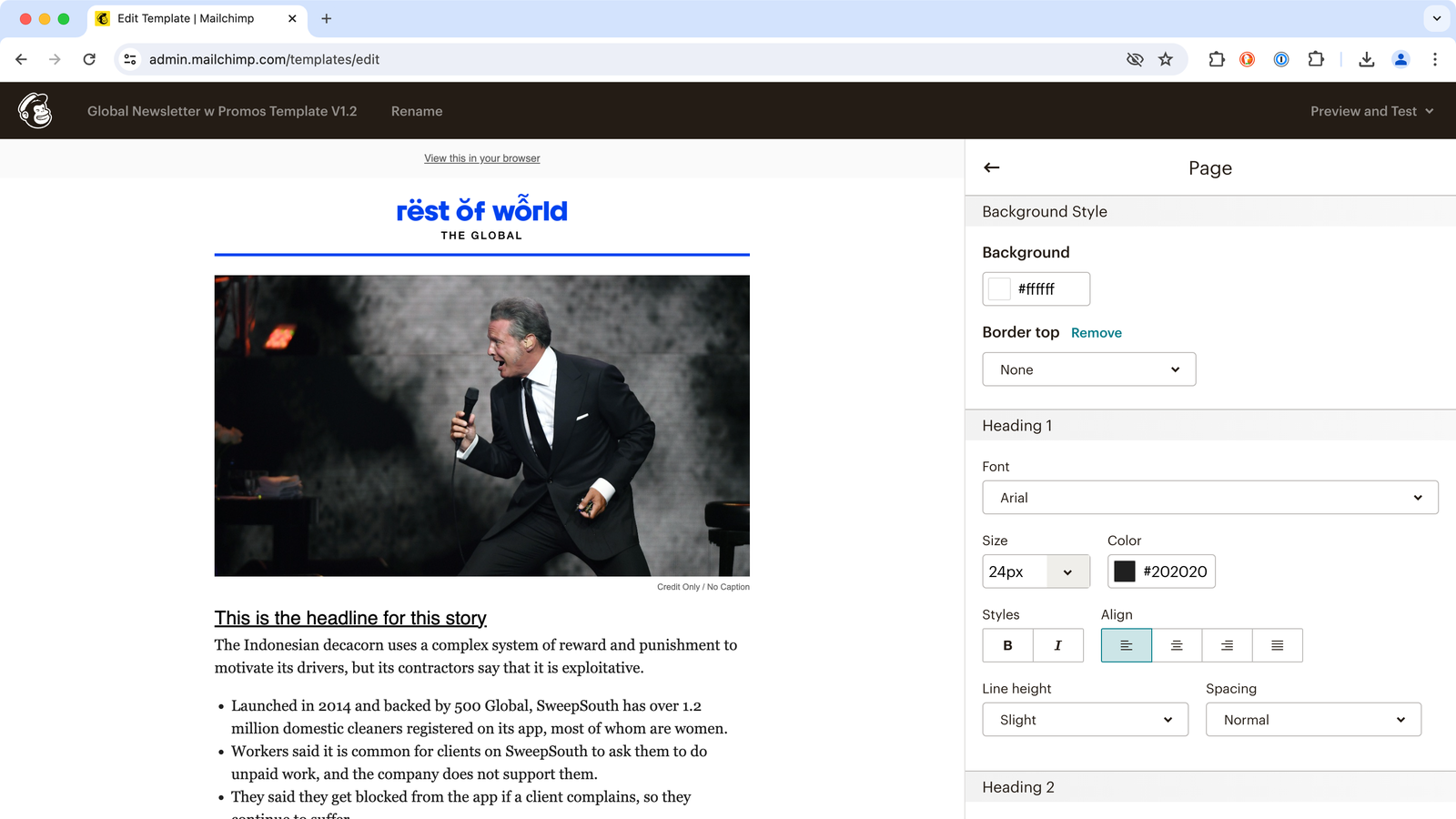
Our newsletter now has a name, The Global. Previously it was called the “(Rest of) World Newsletter” on the signup page, but this wasn’t particularly strong branding, we felt, and didn’t appear anywhere on the newsletter itself, so it seemed a good moment to rechristen it. We had a few strong candidates, but felt that in the end, “The Global” was simple, memorable, spoke to the reach of our coverage, and allowed for differentiation from our Exporter newsletter or any others that we may launch in future.
Small Changes, Big (Visual) Impact
The smallest changes may have a more noticeable impact — our link styles have been simplified and made consistent throughout the newsletter. We moved away from competing link style treatments in favor of consistency and readability. We tested standard blue link text against black and found that the latter performed somewhat better for engagement, so we’re sticking with it.
We also consolidated font styling, limiting san-serif font (Helvetica/Arial) to headlines and newsletter copy; and growing usage of serif font (Georgia) for content. We believe that in terms of readability it brings with it a clearer structure and hierarchy. We think that will make our newsletter easier to skim and to engage in the areas you care most about.

Content updates
When we make content shifts in a newsletter with strong engagement from its existing audience, we want to be sure we’re not fundamentally changing the experience that so many subscribers like, but rather enhancing it, adding value. We also don’t want to add so much to the experience that the newsletter’s primary purpose is diluted, and people cannot find what they’ve grown to appreciate. Our newsletter’s central features have always been providing links to our most recent articles, links to what we’re reading, and a few fun and engaging sections to delight readers and keep them interested, so anything we tweak shouldn’t change that. Since late last year we’ve made a few content shifts, all with a keen sense that they must add value and not take away from the existing experience.
The first of these was our photo quiz, On Location, which replaced Stat of the Day. It’s been a hit with audiences, and gives us a way to show off our huge archive of amazing photography. We quietly introduced our Regional Dispatches, where each week a reporter or editor from the regions we cover gets to comment on key developments happening in their part of the world. This gives our readers a greater connection to the people behind our journalism, and adds value by serving readers with bits of news and insight that are completely in line with our other coverage (and that can’t be found anywhere else). It took the place of 3 Minutes With, our interview series with notable figures in global tech. 3MW is still accessible in the newsletter, as an item in the recent stories section. It’s also now being distributed via a 3 Minutes With LinkedIn newsletter, and already has 2,600+ subscribers, a much better fit all around.

One content update you won’t see came from something we’ve had running on the site for some time: bullet points under the featured article that explain some of the story’s key takeaways. We know that many of our readers like the opening section of the newsletter as it gives a list of our latest stories at a glance. We wondered if news skimmers would appreciate getting a little deeper into the critical issues inside our featured articles. What we learned after several weeks of testing is that this actually weakened engagement with the newsletter overall. Lesson learned: subscribers can now get all the top stories in an efficient list without any distractions.
On Background
Changing the background color of the newsletter was the smallest change in terms of effort but one of the largest in terms of visual impact. We were split internally on whether to do this and we’ll be interested to see how our subscribers respond. This update switches out background from Dawn (Hex Code #FFF3F3) to simple white (#FFFFFF). In the end this was not left up to a roll of the dice or committee. You can learn more on our color usage in our Style Guide.
The usual reason for walking back colors can often be for accessibility; where there are not enough contrasts between text and background color that creates accessibility issues. But we already had a Contrast Ratio of 19:1 which passed WCAG levels for small text (and the latest change improves it slightly to 21:1).
While it’s difficult to point to many small reasons for and against this change, a prominent one was the Gmail iOS app, which insists on surrounding any email in a white frame.

Our newsletter, while based in HTML, is not rendered in a web browser. The variety of email clients and their larger UI means choosing a background color is a gamble. You might know the dominant email client but you want to look good in all of them.
We aspire to have our content feel native to the environment, and this was a small but important cognitive break to address. We’re not opposed to returning to our color background roots but we want to see how this new color works for a while. (Unrelated: Did you know that until recently (2022) Microsoft Word was the rendering engine for HTML in Outlook. Even so, you can expect millions of people to still use older email clients for years to come; Microsoft won’t end support for those until late 2026.)
All of these shifts in design and content came about with a lot of planning, strategizing, and some debate among our product, audience, and editorial teams, and through input, testing, and production from our newsletter editor, Paula Cho. And we’re going to continue watching how all of them impact the performance of the newsletter with readers. We hope these visual clarifications, bits of additional info, foregrounding of our team members’ voices, and more will delight and engage you, our readers, even more. Let us know what you think by reaching out to hello@restofworld.org!