How Rest of World gathered and visualized data for a story about Oman’s space ambitions
In October, Rest of World published a feature by Laura Jedeed about Oman’s ambitions to develop its space infrastructure and position itself alongside giants like the U.S. and Russia. The story highlighted how Oman’s strategic location and geopolitical conditions, along with sufficient government backing, helped local company Etlaq become the Middle East’s premier spaceport.
The editorial team used data and graphics to illustrate the current state of space launches around the world. We relied on data compiled by Jonathan McDowell, a renowned astronomer and astrophysicist formerly based at the Center for Astrophysics | Harvard & Smithsonian. McDowell is also the author of Jonathan’s Space Report, a monthly newsletter about space launches. His website contains some of the most detailed and authoritative databases of orbital and suborbital launches, launch sites, satellite operations, and decommissioned satellites.
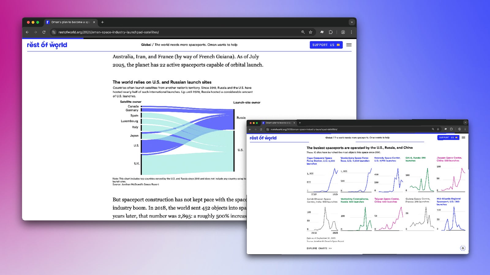
The primary objective of this piece was to show how Oman was entering a market dominated by Russia, China, and the U.S. Using the launch logs available on McDowell’s website, we were able to get a list of more than 17,000 launches across the world since 2010. We grouped the launches by country and year and found that, as expected, these three countries hosted the most launches. We then filtered this data and mapped the number of launches over time at each launch site.
The high volume of launches, specifically in the U.S. and Russia, includes some carried out on behalf of other countries that lack the infrastructure to launch satellites on their own. We wanted to highlight it using a sankey chart that would visualize the dependence on U.S. and Russia’s spaceports well. Sankeys are very effective when it comes to representing flows or connections between two data points.
However, Datawrapper, our primary tool for data presentations, doesn’t support sankey charts yet. That meant we had to create a custom chart from scratch. We first used rawgraphs.io to make a rough skeleton of the chart. This easy-to-navigate and free tool helped us size elements of the chart, including the flows, according to the data. We then pushed it into Adobe Illustrator to add the customized fonts and colors we use here at Rest of World, according to our style guide.
Then came the toughest task: making the chart interactive and responsive. After multiple attempts of trying to make a combination of D3.js and ai2html work, we ended up writing a single script that handled interactive elements and was also compatible with a mobile version.
The final steps included a rigorous process involving both the editorial and product teams. It incorporated feedback on the chart’s fundamentals and its representation, as well as ensuring it integrated well with our CMS and could be deployed without any errors.
You can explore more of our charts and data-driven work here.