Product Updates: Satellite Scrollytelling and Charts Journeys
This month we launched a satellite project using a new scrolling video experience and created new journeys to charts.

It’s July! We’re halfway through the year, and we’ve been traveling, taking leave and building cool things while at work. This past month saw the Product Team launch our first use of scrollytelling video onsite and improved user journeys to Charts.
A reminder that if you’d like to get these product updates as soon as they drop, you can subscribe to our RSS feed, and if you have any questions, thoughts or feedback for us, please don’t hesitate to reach out at hello@restofworld.org.
What we’ve been up to 🚀
Satellite internet project
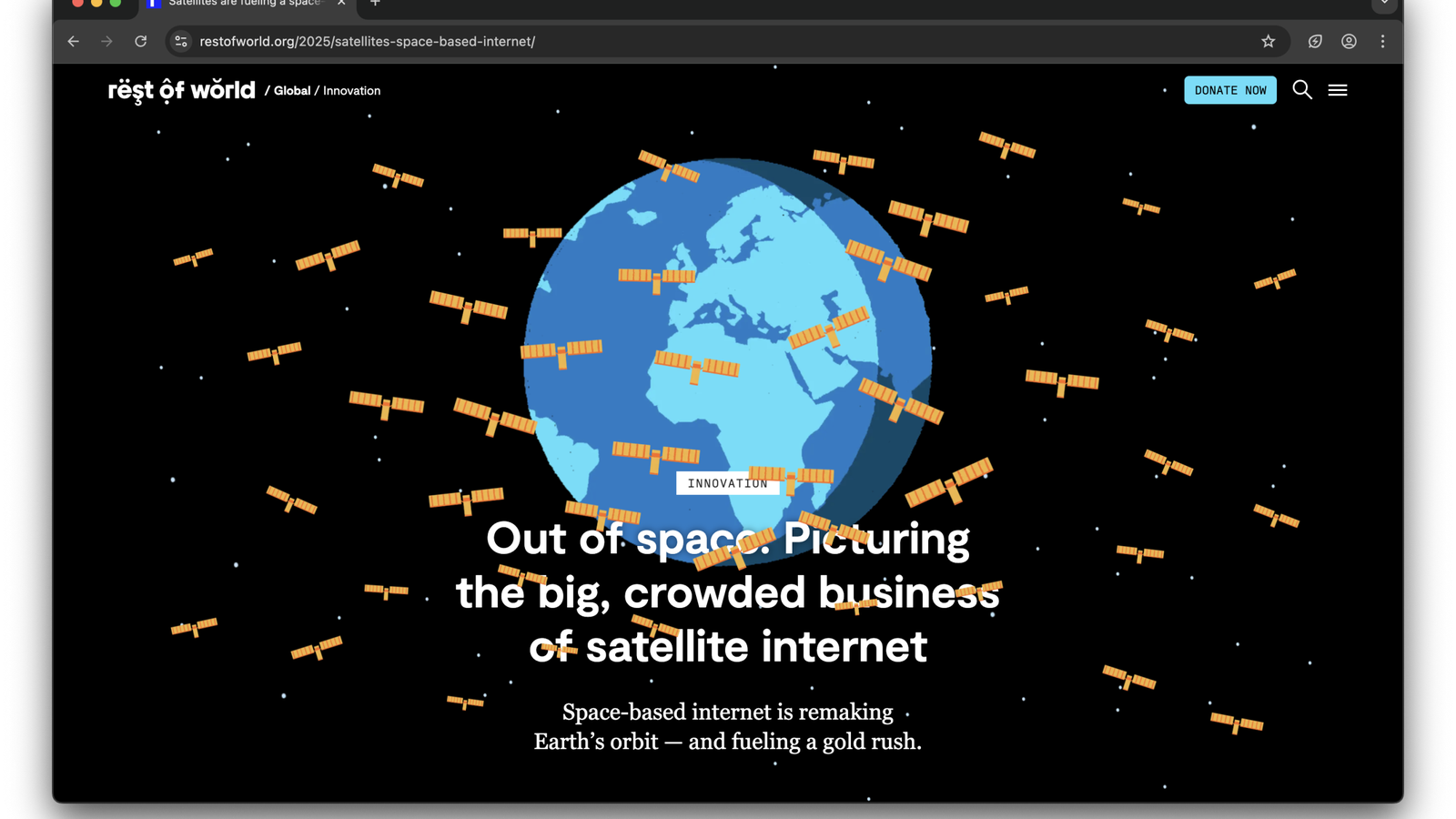
Last month we published this story that visually explores the big business of the satellite internet, comparing the market dominance of SpaceX’s Starlink in comparison to other emerging providers like Spacesail and Eutelsat OneWeb.
The story experience was designed by Joanne, our designer, in collaboration with our product, editorial and art teams, and includes a colorful, custom header that utilizes illustrations created by Studio Muti to demonstrate the crowded satellite market, as well as a custom palette and background that mirrors the night sky.
This also happens to be the first time we’ve ever used a video scrollytelling experience in a story. Anna, developer, utilized a free JavaScript scroll trigger library in combination with our existing conveyor gallery, to implement a smooth scrolling experience that times and pairs video with text based on user’s scroll behavior. We’re excited that we now have this functionality in our box of tricks, and look forward to trying it out again with even more ambitious visual projects.
As with many of the custom projects we do, one of the main challenges for this project was optimizing all of the video, GIFs and images to make the page speed as performant and accessible as possible. So if you read the story from Kathmandu we do hope you have as good an experience as someone viewing the story in New York.
Charts, charts, charts
As we mentioned last month, we’ve given our charts a new home on the site.
First we built the experience, and now we’ve plotted user journeys to them.
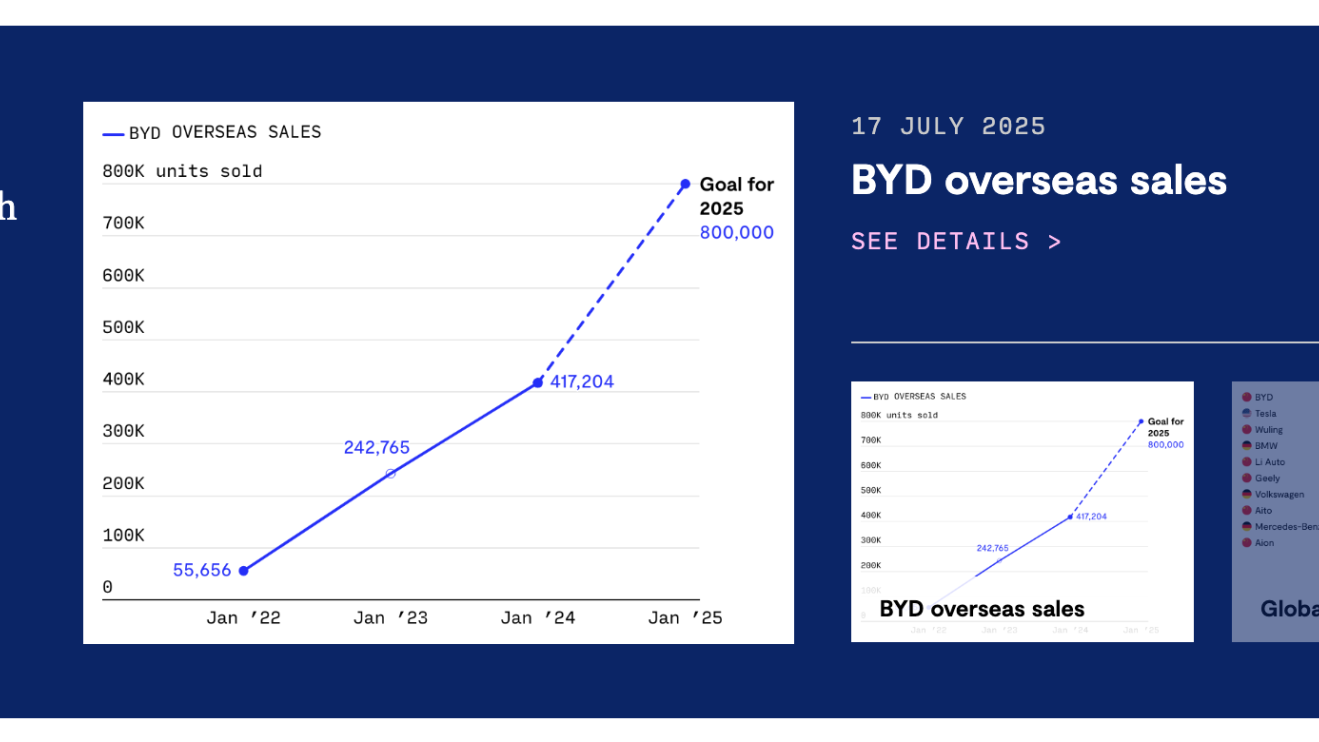
In the past month we’ve launched a charts module on tag pages that displays charts related to that term, and have also introduced a new interactive promo on the homepage that showcases the latest charts that we’ve published.
Booklist
Although this booklist template hasn’t deviated too much from previous years, we’re giving this an honorable mention as we continue to love the layout for this format, as well as the book selections this year. We often create wonderful custom experiences for new story formats, and it’s always a great feeling when our annual booklist continues to delight readers. Happy reading!
Product data and things we learned 📈
Newsletter read time indicators
If you subscribe to our newsletter (and if you don’t, you should, it’s free!) you may have noticed that we’ve been experimenting with read time indicators (e.g. 3 mins read) on our weekly roundup of stories. Our newsletter editor, Paula, ran 3 experiments over 3 weeks where we tested links with read time indicators against our standard treatment.
Overall the sends with the read time indicators had a marginal improvement in overall clicks, but when we dug into the stats we found that actually the read time indicators had a marginal negative impact on click-throughs on the digest section, particularly when the story was a lengthy one. Interesting!
We’ve pressed pause on including them for the time being as we don’t want to add additional clutter, or put people off diving into more in-depth stories.
Related stories
We played around with a new simpler design for related stories, but have reverted back to the original design as the change had absolutely no impact on engagement, and the original design just looked better. ✨The more you know.
In case you missed it 🎧
We’ve put our Long Reads series on hiatus after a great run. We ran the project as an experiment to test engagement with audio, and it’s shown that while there is definitely a small, highly-engaged listening audience, we don’t quite have the resources to continue to produce it.
If you’re a Long Reads listener, or indeed have strong opinions about Rest of World producing a podcast, we’d love to hear from you – shoot us an email. And while we won’t be producing new episodes for the time being, you can continue to listen to our archive of episodes onsite or your favorite podcast platform.
Finally..
Questions? Feedback? Feel free to drop a note to hello@restofworld.org, we’d love to hear from you. Enjoy the rest of July and catch you in August 🏄