Charted Territory
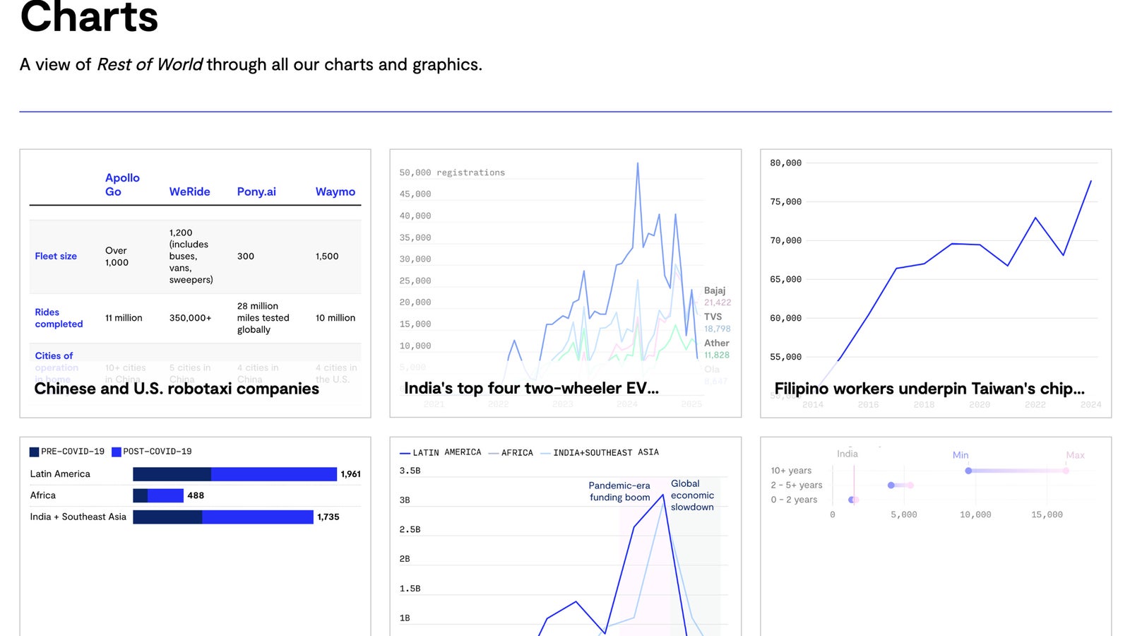
We’ve quietly launched a browsable archive of every chart we’ve created. It's a new way to explore our journalism one bar, line, or dot at a time.
This is a soft launch. Actually, it’s a silent one, until now.
This week, we quietly rolled out individual pages for every one of the hundreds of charts we’ve published over the last five years. These visuals have appeared across our stories, covering everything from Meta’s family of apps non-ad revenue to TikTok Shop’s rise in Southeast Asia. Some are simple bar charts. Others are deep dives into network effects, policy shifts, or economic trends. Wherever possible, they’ve included links to the underlying data.
We call it: Charts. That’s just what they are.
Normally, a launch like this would be paired with callouts, promotional slots, and a proper path to discovery. Those take time and they are coming. We didn’t want to wait on what we had in place. So we flipped the switch. The archive is live. And now we’re telling you.
Why? We could prototype something like this, sure, but for us, building it outright was just as fast. Now we can see what we’ve got, understand how best to use it, and figure out how it fits into the rest of our site, and if our current plan holds up to our imagination.
Also: it’s fun.
For five years, we’ve been publishing charts at a steady, predictable pace. And then forgetting about them. They’d show up in a story, make their point, and then vanish like… well, like tears in rain.
Not anymore. Every chart now has a home. They are built in Datawrapper, interactive, link to sources when available, and can be easily shared or downloaded. Some you’ll recognize. Some you’ll be glad you missed. All are part of the visual record of our reporting.
This is also part of a broader effort to better surface and reuse the great visual work our editorial team produces. Illustrations, photography, graphics – each deserves the same attention and are on our radar.
For now, we’ll be looking for smart ways to resurface charts in future stories and pages. We hope you find some that surprise you, clarify a point, or just add to your reading experience. Feedback welcome.