Best of the Rest of World Product Team in 2024
Our design and engineering highlights from the past year.
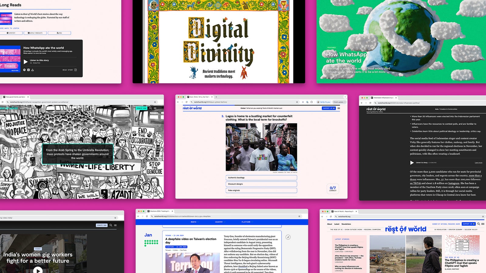
It wouldn’t be the end of the year without our usual Product team reflection on our favorite visual stories, projects, and features. Here, we take a look back at what we achieved and what we hope to bring into the new year.
We’re a small team, but what we lack in size, we make up for in talent, hard work, and imagination. Last year, we were thrilled to see that talent recognized (officially!) with our first National Magazine Award in the Design category. While we know we’re awesome, external validation feels pretty great, too. Hurray for us!
The type of “Product” work we do daily ranges from updating how our articles look in Apple News to building custom WordPress blocks and animating illustrations in stories. We work closely with our Editorial and Visuals teams to interpret stories and add design and engineering magic. We also collaborate with our Audience and Development teams to create new products and features for our website and other platforms that aim to delight, inform, and inspire readers.
This is a roundup of what we, the Product team, consider the “best” things we created in 2024 to elevate nonprofit journalism and connect with a global audience.
Our 5 best visual stories and projects
Digital Divinity


This huge project explores the weird and wonderful ways in which technology and religion intersect. The illustrated storybook concept emerged as a beautiful collaboration between Cengiz Yar, our former deputy editor; Glenn Harvey, the illustrator; and the Product team. The entire experience is designed to look and feel like a religious storybook that invites readers to dip in, explore, and scroll at their own pace.
You can read more on the genesis of the full project here, but some of the highlights of building the experience were: the cool glowing effect on the illustrations on certain Apple devices, the sliding page effects on scroll, and the animated illustrative flourishes dotted throughout the project.

Some additional fun facts about this project: The tiny serpent above the footer is inspired by our very own chief product officer, you can see some of the team members prancing merrily in the illustration on this story, and although Cengiz (whose head you can spot on top of a bird here) encouraged everyone on the team to get one of the illustrations permanently inked on their skin, no one has taken the plunge (yet). Poor show!
2024 AI Elections Tracker

In case you missed it, there were A LOT of elections this year, so when the Editorial team approached us about developing a visual database to track and visualize occurrences of AI being used in elections, we were both intrigued and daunted.
Ideally, every project begins with detailed requirements before a single line of code is written. In this case, we were designing and driving the car simultaneously. The big questions were: What examples of disinformation could we expect? In what forms might it appear? And how could we surface this information for both readers and researchers? We had a few examples to start with, but we knew more would come in from platforms that may handle content in very different ways.
Our past work gave us extensive experience with content managed through spreadsheets. It’s not the most user-friendly interface for editors, but it is accessible and flexible. Normally with spreadsheets, we follow a row-per-entry format: A new entry means a new row. That works when you know exactly what the data points will be and can represent them in columns. This was different. With each new entry occupying its own column, we gained the flexibility to add content and data points as they emerged.
This project underscored the value of flexible back-end systems and iterative design processes. Even with evolving requirements and unconventional data structures, a nimble approach allowed us to deliver a robust solution for a complex problem, and that was before we even considered the front-end user experience.
Facial Recognition

Great illustrations always inspire us to try to bring them to life, and this project was a great example of that. This story is about the dangerous effects of facial recognition technology on mass protests around the world, and we wanted the lead-in header to reflect that threat. Could the large eye hovering over the crowd appear to loom larger and closer as you scrolled? Could the image recognition squares appear to hone in and focus on individual faces in the crowd?
We created the looming eye animation but, ultimately, having it transform on scroll proved too janky, especially on iOS. We could have used a robust external library for a smoother experience, but one of our core tenets is to ensure our website works well even on slow connections, so we always keep things minimal, and develop nearly everything in-house, bespoke to our needs. We nixed the fancier but heavier effect for a repeating animation — pulsing and glowing —that we knew would work well for all readers. For the image recognition squares, we created a slightly different animation for each one — circling around the target, blurring and focusing — trying to recreate the visual effect of a camera locking onto its mark.
We repurposed one of our standard article blocks to make an extra-tall header, stitching together multiple images to appear seamless as the reader scrolled through introductory text. We tied the visual experience together with a custom dark color palette and illustrated facial recognition squares for dividers, navigation bullet points, and our endmark.
And, as we always do, we pause the header animation once it’s no longer in view, to keep the page as performant as possible. ✨
How WhatsApp ate the world (and other stories)

Early on in the process from discussions with Editorial, we knew we wanted to animate the illustrations for this series on how WhatsApp has transformed the world. These stories delved into a communication phenomenon that is big, dynamic, and global — and we wanted to reflect that in the visuals by using eye-catching movement. We were so excited when Rest of World art director, Munira Mutaher, told us the talented illustrator Joanne Joo (not to be confused with our designer Joanne whose middle name also happens to be Joo.) had been brought on board. Joanne creates these fantastic 3D scenes that look like they’ve been molded from clay, a style that we don’t get to work with often, and was sure to set this series apart from our other coverage.
Joanne already has her own experience with animation, artfully incorporating seamless looping motions into her works. However, we wanted to try using code on our end this time for these header illustrations. Doing so would not only result in a lighter weight and faster loading page but also allow us to tie the animation to the page scroll for an extra layer of interactivity.
Communication was crucial for the plan to go smoothly, so we gave detailed delivery specifications to Joanne who understood exactly what to do. All the elements in the Photoshop file were on their own layer and illustrated in full even if they were cropped off canvas. We then pieced everything back together in the story header, added subtle bobbing motion to certain individual objects like the floating characters or message clouds, and finally added more dramatic movement when the reader scrolls down the page.
What results from this collaboration is a delightfully engaging (and performant!) experience.
Gig Workers Rising

This collaboration with Context Newsroom was the first video series we’ve ever done at Rest of World. It explored how gig workers are self-organizing across the globe to improve their working conditions. Given the scale and ambitions of the project, we wanted to build the best experience on-site that would allow the video stories to shine.
Building off previous development work we did for a video documentary for China: The World’s Shopping Cart series, we created a video playlist experience using our standard article template. We use a darker color palette to evoke a “cinema” experience, and made the video and play button the focal point of the page to encourage the most engagement.
The playlist at the bottom of the page lets you seamlessly autoplay videos (which are actually separate articles). We staggered publishing in this series to a monthly cadence, so this playlist feature initially included preview images from future videos, and teased which month they would be published to encourage return visits.
Notable mentions
You think these were the only things we worked on last year? Think again!! Here are some smaller projects with notable Product magic:
- Riders in the smog
- Inside the BJP’s WhatsApp machine
- Destined for clicks: YouTube is driving an astrology boom in Pakistan
- Can a church exist exclusively on the internet?
- Breaking down the world’s tariffs against China’s tech industry
Our best user experiences and product features
Oh hey, you’re still here? Well, guess what?! On top of ALL of the things we do to support visual storytelling, we also constantly look for ways to make our site experience more intuitive, user friendly, and delightful while delivering Rest of World’s journalism to readers in ways that they want. Here are some of the things we did this year to support that.
Long Reads

Early in 2024, we launched our first audio product at Rest of World, a “podcast-style” series called Long Reads. It’s narrated versions of our longform features, recorded by our staff, and produced with music and sound design. To support this series, we built a full audio player and playlist on our site, and a wonderfully intuitive, embedded player experience on stories with accompanying audio. We also created a delightful module on our homepage that displays the latest stories in the series.
This was a big design challenge as it required designing for multiple touchpoints and experiences on our site, as well as a reusable template for episode artwork on Spotify and Apple Podcasts. The result? We can now all listen to the latest features while we noodle away at work, wash the dishes, or take a stroll.
Homepage Latest Stories

Last year, one of our goals was to increase engagement with our homepage and make it more useful and user-friendly for our readers. We’ve been making incremental changes throughout the year, but one of the changes we’re most proud of is the updated “Latest Stories” module. This was a simple but significant change that has seen engagement dramatically increase (particularly on desktop where it’s displayed most prominently.)
So what did we do? When we reached out and spoke with readers during the year, we observed that the previous “Recent Stories” module was getting lost within other elements on the homepage, creating some confusion among readers (and our own staff) because not every story featured there.
We addressed these issues by ensuring that the module displayed all of our latest stories chronologically, and made the module visually distinct from our curated “Top Stories.” We also added helpful read-time indicators to each story and collapsed the module on mobile so readers can scan and scroll as they need. Now the module is “snatched,” as we might say.
AI narrations

Building AI-generated narrations for our stories was such a fun project, and one of our first times interacting with OpenAI’s text-to-speech API. We had great fun assessing the various text-to-speech services and voices, and took votes on our favorites.
We developed AI narrations as a WordPress plug-in, and now when we push a little button within our CMS we pass the data from the story to the API, and the API returns the narration in chunks that are then assembled and loaded on the story when you press play. Simple!
We’re now working on a clever way to automatically publish narrations based on certain criteria, and we’re hoping to open-source the plug-in in the new year. We wrote about the recent launch here if you want to learn more.
Quiz Templates

In 2023, we built our first quiz experience at Rest of World, for this Temu quiz, and this year we worked with the awesome Audience team to adapt that format into a new quiz template that would allow us to create as many fun quizzes as our hearts desired, both on-site and on external platforms like Apple News and Flipboard.
The template is built around a standard article layout in WordPress, but we’ve written some very clever Javascript to interpret the output and structure the entire experience as a multiple-choice quiz, complete with an answer counter and results that can be shared at the end.
If you like a quiz, you should check out the series (not going to lie, some of them are pretty hard) and we also encourage you to sign up to our free newsletter so you can participate in our delightful, weekly photo quiz. Test yourself!
Subprops aka adjustable promotions

This year we came up with a clever system for how we create and move promotions (e.g. our newsletter sign-ups, audio promotions, membership promotion, etc.) around our website.
These promotions have been placed within our global navigation, homepage, and articles, and allow us to target their placements based on certain conditions like time, article type, and the country an article is associated with.
Previously, if we wanted to run a small promotion for something like our photo contest, we would have to write some code and time a deployment, but now we can set up everything in advance, set some conditions in a config file, and everything is taken care of.
It’s really flexible, lightweight, and gives us control of what we want to promote across our site. Genius!
Oh hi, 2025 👋
In 2025, we plan to launch even more amazing story treatments and product features that improve the overall site experience. We’re always learning and improving, so if you happen to spot any bugs, have any feedback or questions, please feel free to reach out to us at product@restofworld.org.
Additionally, if you’re willing to speak with us, we’ll be conducting user interviews throughout the year, and would love to hear about your experience as a reader. You can sign up here.
If you made it this far, then thanks for taking the time to read this! Happy new year and please keep reading Rest of World into 2025!!