Product Updates: Charts, Style Guide and Experimentation
We’ve launched a new Charts index, published updates to our style guide and continued to launch tiny experiments.

Hello again, and welcome back to our June installment of product updates. We’ve been busy over the past month with a whole new Charts experience, an updated Style Guide, and the continued rollout of little experiments.
Want these updates as soon as they drop? Subscribe to our RSS feed. Have any questions or thoughts? Reach out to hello@restofworld.org. Let’s go!
What we’ve been up to 🚀
Charts
We’ve silently launched an entirely new experience called Charts, that pulls all of our published embedded charts into one place for your exploration and perusal. Each chart has its own dedicated page, with an interactive chart, link to the original story and related tags. We’re also lazy-loading all of the charts on the pages, so you can continue to dive deep down the data rabbit hole. Michael wrote more about the launch in a post here.
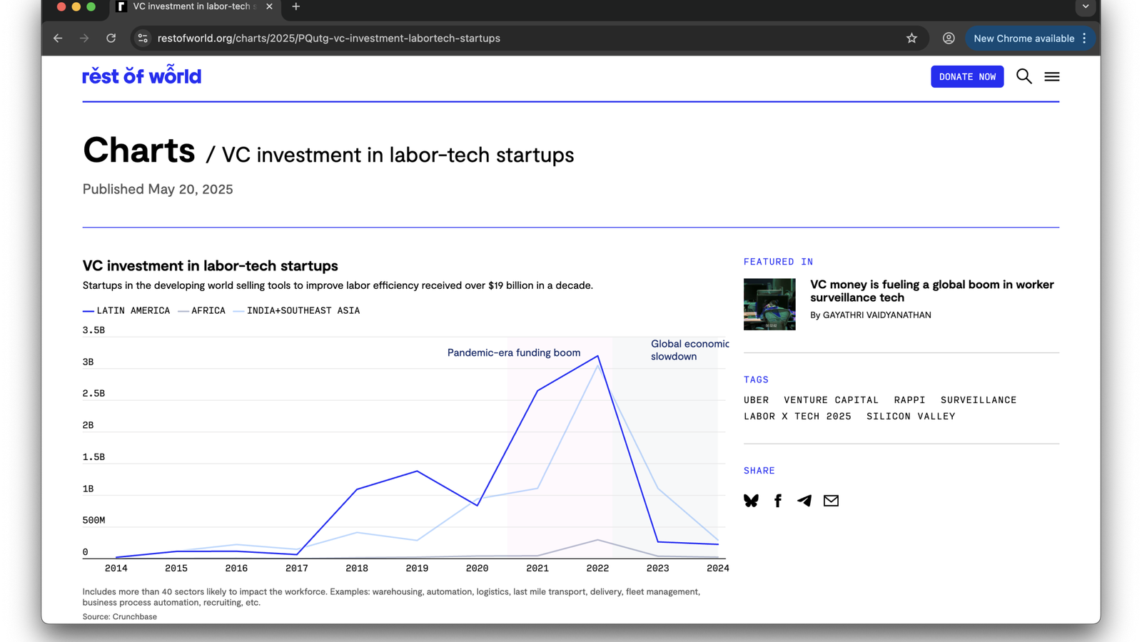
We’ve also rolled out a couple of ways to help regular readers discover charts on site by introducing a charts promo and a discover and share link on embedded charts on stories. We’ll soon introduce a related charts module on tag pages, and will be turning our attention to give charts a home on our homepage. Stay tuned.
Style Guide
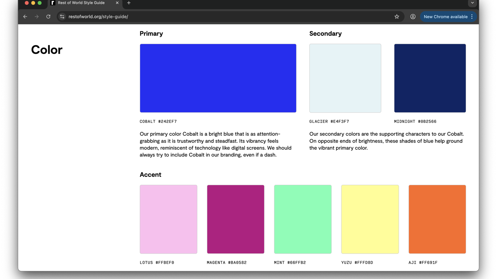
Earlier this year we rolled out our new palettes and styles and we’ve now updated our Style Guide to reflect these new changes. The style guide acts as the source of truth in understanding what colors to apply and when, how to use our brand diacritics and logos, and what font styles to use in different contexts. Joanne has now added an additional section to cover commonly used components and their styles. It’s a very handy reference guide for all the team when trying to keep our styles consistent when building new features and components across the site.
Lazy-load Scroll Everywhere
Anna has implemented lazy-loading page content across our beats, series, section and blog index for a seamless, scrolling experience. Previously these pages were paginated and required multiple clicks to view older content. This new lazy-loading convention worked really well on our updated tag pages and new charts pages so we’ve rolled it to other page types. Happy browsing.
Product data and things we learned 📈
Sharetools
If you’re a regular site user, you may have noticed that we’ve introduced a share tools module on articles on mobile devices. We’ve been experimenting with copy and placement over the last few weeks to see which variations drive the highest interaction levels, and ultimately decide if it’s a feature our readers will use.
So far we’ve concluded that placing the share tools right before the first paragraph (or the lede graf as those in the journalism business might say) has had the highest click to view ratio at 0.31%. That number is still pretty low, with an average 31 out of every 1000 readers who see the module choosing to share. For now, we’ve bumped sharetools back to the further but we’re going to further explore placement higher in the story but with a different user experience.
Newsletter subscribes
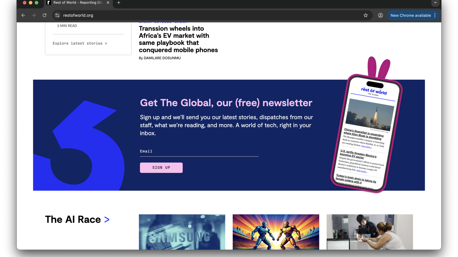
Last month we updated visual assets for our newsletter signup modules on articles and the homepage. We track on site subscribe events, and our hope was that our new assets might drive a little uptick in subscribers onsite. Interestingly, our assets appear to have had marginal impact so far, with an uptick of just 0.16% in subscribers. This is not statistically significant but I’m still stoked that they look so good!
Beats pages
We’ve been taking a look at our Beats and Sections pages and how we can improve them. Through our analysis we’ve learned 90% of readers who visit these pages are on desktop, even though on our overall site desktop users typically make up roughly 35%. As a consequence we’re now exploring ways to help mobile readers discover these pages and browse all of our content by the topics they’re interested in. Watch this space.
In case you missed it ✨
Lily wrote a post documenting all of her favourite, crowning projects and products at Rest of World before she finished her tenure at Rest of World. Give it a read, she’s done some marvellous things!
Finally..
Do you have any questions or feedback for us? Anything on our site or newsletters you love or loathe? Feel free to drop a note to hello@restofworld.org with your feedback.
‘Til next time. ✌